I write this post during election week in the United States, and as I write, the outcome of many national races (including the Presidency) is not yet decided--though that may well change even before this post is published. I picked this topic for election week well ahead of time, feeling like the word concrete might have an oddly reassuring resonance in a turbulent time. We cordially invite our readers to take some breaths, put phones down, and try writing a concrete poem with us as we all wait for all results to come in.
In concrete poetry, the layout of the words on the page is as important as the words of the poem themselves in conveying meaning. In a form of concrete poetry called a calligram, the layout of the words on the page forms a recognizable image that contributes to the poem's meaning. The two categories tend to blur together somewhat, but both use layout to achieve interesting visual effects.
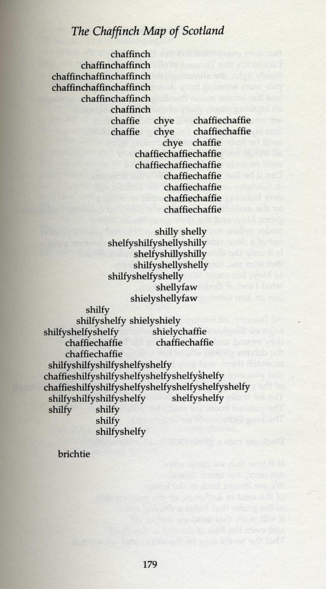
For example, Edwin Morgan's "The Chaffinch Map of Scotland" lays regional nicknames for the chaffinch out in the shape of a map of Scotland:

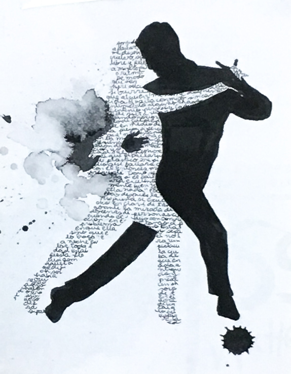
In this detail of a calligram by Lucía Fernández, titled "Historias de Buenos Aires (Stories of Buenos Aires)," the artist fills up a body with penmanship, creating a sense of intimacy and fluid motion. This work was recently featured in the exhibition Birú Pirú Perú: Collective Projects of Peruvian Visual Poetry, curated by Giancarlo Huapaya.

There's an enormous world of calligrams, concrete poetry, and visual poetry to be explored from here (take a look at the pioneering work of bpNichol or the dynamic "performative typography" of Douglas Kearney). Try writing a calligram or a concrete poem yourself: how might a shape on a page add layers to the words?

