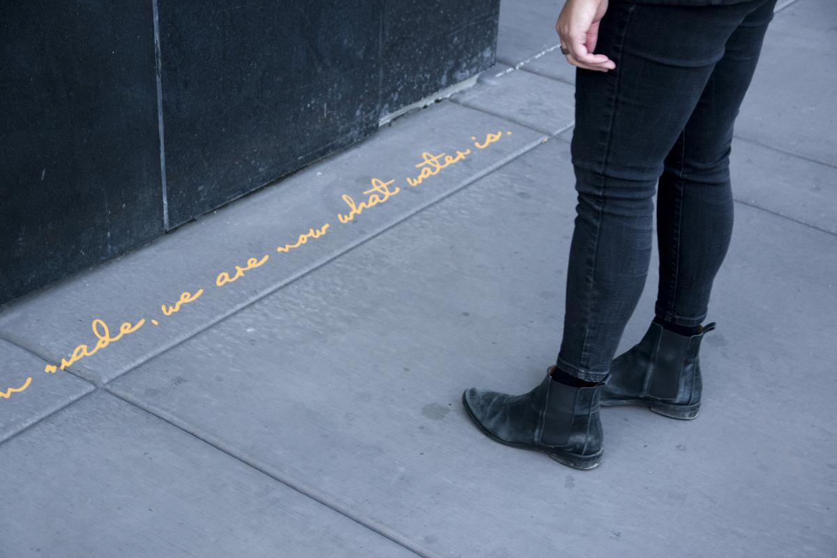
In 2015, along the California side of the Sierra Nevadas, Todd Gilens began the research for the mile-long poem “Confluence,” which was installed on sidewalk curbs along Reno’s Truckee River in 2023-2024 and will be released in book form from the University of Nevada Press. The poem was written to be read in transit, in snippets as well as in its entirety, and had to be meticulously designed in order to fit the space of the curb. From a sonic perspective, this writing bubbles up at the reader and courses along in a flow of sound-repetitions circling the work back on itself. I’m fascinated by the breadth of research that went into this project–from ecology to history to handwriting–so I sat down with Todd, each of us at our respective computers, and conducted this interview.
____________
Laura Wetherington: Can you take us back to the genesis of this project? I've heard you say you're interested in “the use of the curb for more than just parking regulations. It’s a reading space.” What other ideas were swirling around that led you to making a public poem along the river in Reno?
Todd Gilens: I'm a bit of a contrarian by habit, so I tend to get excited when something feels off and I can suggest what I think might be missing. Confluence really was a confluence of such things, coming together over a period of years. One was the curb as a fascinating and ubiquitous element of urban furniture that only engineers and contractors pay much attention to. Another was science, which holds a very charged zone in contemporary Western culture. I wanted to draw out the culture of science, together with its findings - a wish to join human circumstances, the complexities of land and objectivity. A third element, very basic, was the alphabet, which I have been working with in other ways through drawing and furniture prototypes. We use letterforms without thinking about its wondrous technology as a system of shapes that translate and preserve the sounds of speech.
Also in the background is my training in landscape architecture and fine art painting - in particular the representation of landscape. What is presented and what's left out? This is a critical question for every ecologist (the unit and scope of study), and artist or writer (theme and composition). I wanted the project to embody my understanding of subjectivity and change at the scale of a mountain range, which was the subject I set out to describe.
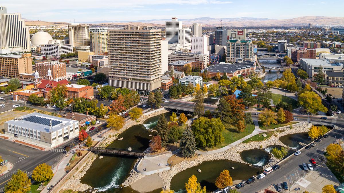
Reno is built around the Truckee River, and is the largest city in the northeastern of the Sierra Nevada's three regional watersheds. The city has the physical & social character that suited the idea of a long poem about flowing water that could be read while walking.
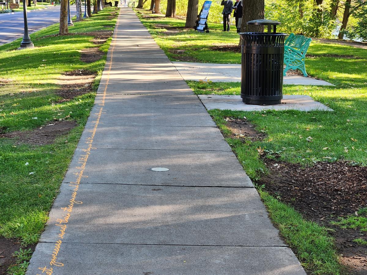
about flowing water that could be read while walking."
LW: In what ways did your writing process account for the fact that this is a non-linear piece in its construction, or that it might be a non-linear experience for the audience/reader?
TG: The poem was designed as connected sections, each with a theme. Section lengths (as character counts) were based on block lengths, and the themes chosen for each section aligned the physical and social character of the locations with aspects of stream science. For example, a stretch adjacent to a high wall spoke of downcutting and valley-building; the section fronting a casino spoke of drought and sudden floods.
An overall design provided me with a picture of relationships between themes and helped me focus. I worked with each section, bringing them all along, moving between them differently each time I sat down to write. Once the text had developed some clarity, any starting point within a section was fine. In writing, I wanted to mimic the experience of a reader who would start reading at whatever point they encountered the writing.
Working back and forth between the computer and print, I went through many versions of line length. I needed line breaks for convenience, but knew that the installed text within each section would be a single unbroken line.
The walking reader would make their own line breaks
Through pace & comprehension & the sounded rhythms of the text.
The installed piece is like a book one opens at any point, reads a line or paragraph, puts down, returns at another spot, etc. The classic epics are like that, working at the level of image, phrase, scene, and story, or like a grand mural - Diego Rivera's comes to mind - that absorb viewers in details and relationships within a coherent and meaningful structure. In a similar way, we encounter running water "as a fragment of a whole." (*from the last section of the poem), which is, perhaps, why nature is so satisfying and nourishing: the details are fascinating, and it feels integrated in its relationships across scales.
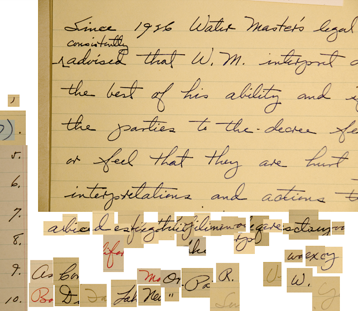
the Federal Water Master for the Truckee river basin from 1958 to his death in 1984.
LW: You also developed your own font for this project. Can you say a bit about why and how, and what impact this had on your overall design/composition?
TG: Fonts are an essential flavor to the meaning of a text, and the work would be as much visual as readable. But how to choose? Cursive seemed obvious, expressing the continuity and ideosynchrony of running water; and in a very different parallel, cursive and water are both threatened resources. I also wanted the installation to have the sense of personal address that handwriting expresses, even without knowing its author. It's a more intimate connection than the formal letterforms.
Using my own handwriting seemed too limited, and I wondered if a font could be made from some historical person's hand. I had no experience making fonts—which made the prospect attractive! I learned along the way that connected fonts are one of the more difficult things to design.
My process had two sides. A wide-ranging search for the writing on which the font would be based involved searching archives in person and remotely, with the help of archivists throughout the West. I was looking for beautiful, legible writing from a person whose life story would be meaningful as a backstory in the project. Claude Dukes, who was Federal Water Master for the Truckee river basin from 1958 to his death in 1984, fit my criteria best.
Cursive seemed obvious,
expressing the continuity and ideosynchrony of running water;
and in a very different parallel, cursive and water
are both threatened resources.
The second part was to 'read' documents for a complete alphabet of capital and small letters and punctuation. Working from scans or digital photographs I'd isolate each letter as an image, then software would assign it to a keyboard key. I remember requesting several boxes of material from an archivist. He asked what I was looking for and I had, apologetically, to say "a K." Eyebrows were raised.
I made two trial fonts during a residency at Digital Arts Studio in Belfast, UK, and found the process workable. The Dukes' font was made while the rest of the project developed in parallel. A few months before production I enlisted Andrei Ograda, a professional font designer, to refine the letter spacing and connections.
Though I didn't use the font on the computer while writing the text, knowing the work would be expressed in this font added a dimension, a sort of alliance, with Dukes. It was a relationship across time and circumstance, which I imagined as a friendly companionship, an encouragement within the complex world of water, people, and institutions.
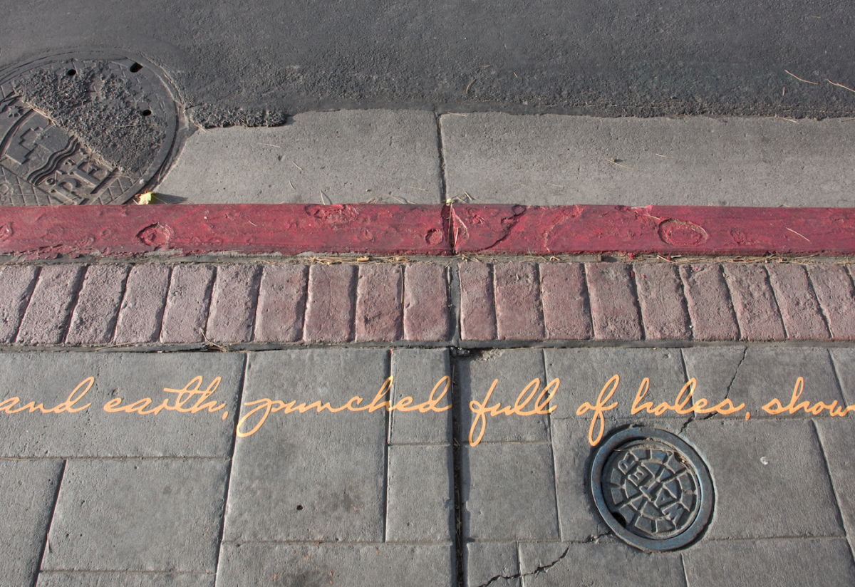
ecologists study streams as living systems, and stories orient us to the places we’re in.
LW: How did you figure out how to make the poem fit within the space constraints (writing something a mile long, but also, ending a word or thought where the curb stops for a driveway, or moves to the next block...)
It forced me to think of language spatially
alongside the other dimensions of meaning,
rhythm, sound, and image.
Words really are things!
TG: Most of my sections had space for hundreds or thousands of characters, so I could write what I wanted, then trim or elaborate to meet the goal. Also driveways were subtracted from the original measurements that determined the character count so we could skip them as needed. In critical situations we laid out the strips of text and, if necessary, look for a period to add a gap or a comma to edit out a phrase. But these situations were few.
There was one area where very short sentences were interrupted by planters and the length of each sentence was critical. In other areas we had to go corner to corner over one or two hundred feet, and in others, there was only a hard stop at one end, with the other end starting part way down an alley or street. In those last situations we'd start the installation at the fixed point and work back from there, which usually meant installing the writing in reverse.
I did some warm-up experiments in very restricted writing, twenty or so short statements about stream ecology that each have ninety nine letters. It was challenging, and I found some useful strategies, like pluralizing words or using shorter or longer synonyms. It forced me to think of language spatially alongside the other dimensions of meaning, rhythm, sound, and image. Words really are things!
(A handful of these were published in Ecotone Magazine.)
LW: Thinking of rhythm, you've said before that the river became a background to the writing, and I wonder if you can say more about how the sound of water influenced the rhythms or the sound patterning in the work. I’m thinking, for instance, about the sentence, “When stories are placed in parallel lines, what we call ‘things’ return as processes in time.”
TG: In referring to running water as a background, I may have meant that visitors to the work would hear the Truckee River as they read, alongside traffic and rustling leaf sounds. It's a very different environment than the quiet isolation of book reading.
The core soundscapes in my research were mountain streams - cascades, riffles, pools. Streams have a kind of loping repetition of high and low sounds, a range of volume near and distant, constant but never quite repeated, a rich variability that makes them such a pleasure to listen to. They also have a stretched-out structure, perhaps like the sentence you referenced, and like much of the poem. Run-on sentences and long strings of images were my friend in rendering the stream experience.
The core soundscapes in my research were mountain streams—
cascades, riffles, pools.
I worked with researchers to gather data, and we'd walk back and forth in a stretch of stream for six hours at a time, measuring, collecting samples, and exchanging observations. The survey work itself had a rigorous and repetitive rhythm.
And I read with an ear toward rhythms that felt vital to the work: Ovid's Metamorphosis in Mandlebaum's translation, Heaney, Robert Hass' A Little Book on Form, Alice Oswald's A Sleepwalk on the Severn, George Buchanan's Green Seacoast, Dylan's ballads, and Sonheim's lyrics, among others. So the writing was a kind of three-sided pincers technique, drawing from the environment, activity, and language.
LW: I love the idea of writing as a claw. Was this your first public art piece? What did you learn about making public art from this process & do you have any advice for people just starting out in this area?
TG: You've animated the metaphor of the pincers, which I borrow from Gregory Bateson (Steps to an Ecology of Mind, Mind and Nature); I believe he's thinking of a lab tool as a model for understanding that is achieved by using multiple approaches at the same time.
To your question. I have been proposing and making temporary public artworks in unconventional spaces since the early 1980's (See https://www.toddgilens.com/four-stories-man-1). Most are self-initiated, sometimes permitted, sometimes commissioned. I have also curated exhibitions of site-specific projects, most significantly, the 1996 exhibition "Prison Sentences" at Eastern State Penitentiary Historic Site in Philadelphia.
The crux of working in public
is the opportunity to join the work and the world
The crux of working in public is the opportunity to join the work and the world, and this always comes with surprises, combinations I would never anticipate, and that extend the work in ways I couldn't have imagined: The proximity of phrases to infrastructure that shift the meaning of both; the smell of cars or breezes layered onto the text; the physicality that rough concrete lends to the arcs of cursive writing...
Each circumstance and community is different, and each of my projects has followed a different line, usually for much longer than I first anticipated. Conditions change, the work deepens, perseverance becomes a generative practice. From a creative perspective, it's important to have a durable concept, one that can take changes or omissions without losing its clarity or scope.
There's so much more to say on publics, commons, and art - I hope we'll have a chance to continue the conversation in some other form.
LW: Thank you for taking the time to chat with me. One last question: where can people find out more about Confluence?
TG: https://www.toddgilens.com/confluence
______________
Todd Gilens is a visual artist and garden designer working with people, places, and ideas. Trained in landscape architecture, he uses drawing, photography and writing as ways to engage sites and subjects. He looks for projects that can be shaped in dialogue with clients and communities, developed through historical research, cross-disciplinary inquiry, and the unique conditions of the places they will inhabit. His focus is on large-scale processes like water systems and ecological change, and how critical but largely invisible processes can be meaningfully encountered. The graphic work through which he develops these projects become their own record of discovery, portable objects for intimate reflection. Together, site-work, and the graphics and objects that research produces, express the complementary relationships of private and public life.
Laura Wetherington is a poet living in Reno, Nevada. She teaches with the International Writers’ Collective and the University of Nevada, Reno at Lake Tahoe Low-Residency MFA. Her latest publication is Little Machines.

